Sunday, November 6, 2011

Magazine Layout Design – “ChungWah Magazine” Vol3, Nov 2011

A4 Magz - ChungWah Vol 3 - CoverAnother issue of ChungWah Magazine that got done under my wings. This issue had been a success to promote the core service of ChungWah association – Age Care and Community Service.

Many more new sections and columns were introduced in this issue, which had given me more areas to explore the layout variation. It is proven the quality of this magazine from the respond received from the readers, in terms of content and the quality of the magazine.

There had been plans made to put forward this magazine from a members only subscription, to the general public whom can now purchase the next issue on news stand. This had been a great leap forward in terms of editorial and of course, more challenge for me to improve the visual design of the magazine.

If you wish to take a peep of my work, you may download the copy of the magazine in PDF from here.

The next issue will be release in January, packed with more information and visual design challenge that had been accomplished, so stay tuned.

A4 Mag - ChungWah - Cover-sml


Check out my work too on previous issue of
ChungWah Magazine – Vol 2, September 2011.


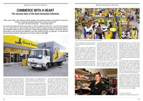
A4 Magz - ChungWah Vol 3 - 34 & 35     A4 Magz - ChungWah Vol 3 - 6 & 7

Wednesday, September 7, 2011

Magazine Layout Design – “ChungWah Magazine” Vol2, Sept 2011

A4 Mag - ChungWah - Cover-smlI had been lucky enough being appointed as the Visual Designer and translator of this magazine, working closely with the Chief Editor on this 80+ pages magazine for ChungWah Association of Western Australia. Of the leading ethnic based society that just had their centennial celebration last year. Potentially this magazine would reach to their members and general public of Perth, especially the Chinese community.

It's indeed a challenging works to race with time, tasting the quick pace of a magazine production. Looking forward to the next issue with more challenging content to work on.

A4 Mag - ChungWah - Index-sml
 
A4 Mag - ChungWah - Chinese Culture - pg36-37-sml   A4 Mag - ChungWah - ChungWah Mother - Pg46-47-sml   A4 Mag - ChungWah - ChungWah Mother - Pg54-55-sml
 
The magazine is now available online in PDF form for download, please click here to view it.

Wednesday, August 3, 2011

Catalogue Design - "WineX", 2011-2012

WineX Product Catalogue 2011-2012 - Cover
This is a 28 pages catalogue design for a local company “WineX” – wholesaler for bar and wine accessories.
The catalogue features a range of products that being categorised in various sections for ease of reading. The feature pages incorporated to demonstrate how a product function to engage more attention from its readers. Providing a break on its standard stock-list layout.

The overall layout designed were given a lift from the earlier years work, and still in beat with the company's corporate style. The new product layout also in aim to engage attentions, not just only a ordering-list.

You may have a quick peep of it’s PDF form from here.

WineX Product Catalogue 2011-2012 - Stakrax Spread  

WineX Product Catalogue 2011-2012 - vinOair Draft Spread   WineX Product Catalogue 2011-2012 - WEB-4   WineX Product Catalogue 2011-2012 - WEB-12

Friday, July 22, 2011

Business Card Design – “INCOMMAND”, July 2011

BC - Incommand - Draft2-1
Business card layout design for a mate, who recently just start his own business – “INCOMMAND”.
The initial minimalist idea were implanted by the business owner, Mr. Andrew Seinor, and came in to put his idea into this production-ready files.
It had been a great pleasure to work with Andrew for this quick turn-around job.

Thursday, July 21, 2011

Magazine Adverts - "jutebags", 2011

APPA CONVEX 11 - JUTE BAG - A5 - PRINT (No Bleed)This is an A6 size adverts that is going to be featured in APPA Convex 2011 Program Magazine. The layout was depicted from the existing layout, colour and font style of the website and other collateral items, such as its business card.
The layout design were based on 3 shade of green, derived from the product “Jute Bag” itself made from all natural bio-degradable material. As part of the connotation to put forward the idea of environmentally friendly and recyclable items as Jute Bag had been.
Three similar but different Jute bag’s product shot had been featured to demonstrate  the versatility of its being brand-able easily for merchandising usage.

Thursday, May 5, 2011

Wedding / Reception invitation, 2011

WI - Gavin&TLing - 00 copyAnother self directed project to create a wedding and receiption invitation for a good mate’s wedding.

The design were based on given information from the couple: their favourite color and intend graphic elements (the tree).

The design had put forward to prepare for print, but due to the overseas printer constrain they have to take the pick from the given template.

But afterall, it is still a good practice work to add into my portfolio collection.

Sunday, May 1, 2011

Magazine Layout, 2011

Magazine Cover - NEWiCON - 00 CoverI guess for most print designer, there’s an irresistible desire to design a magazine cover. My dream job would be working for a well-known magazine publisher as their layout designer, but as said… it’s only a dream. The enormous stress that a designer in a publish-house having to bear is unbelievable.

These is just a tryout that I did as part of my design-practice (having to sharpen your tools sometime), trying to design a cover and a internal spread for a magazine. It is based on one of the oldest Malaysia base Man’s Fashion Magazine that I like, and recently it had seem to be decline in its design flair and content that thus attract subscribers.

Magazine Cover - NEWiCON - 00 Spread

Wednesday, April 6, 2011

iiCommunicate

iiCommunicate_June_2010_Final_Small-1iiCommunicate is a monthly internal newsletter for iiNet, highlighting the news and events of the business to it’s 2000 stuff around 5 locations.

The content of this publication were contribution from various departments ranging from engineerinng, marketing, customer service front, as well as contribution from individual staff on light-reading material (such as recipe and travel journal). It was a 15-page PDFs that evolved to a 40-60 pages eletronic publication.

The pages are mostly individually designed, apart from themed sections that highlight the relevency of the contents. This project had been constantly a challenge due to the short turn around time to produce a ‘full-volume’ electronic magazine as such.

iiCommunicate_June_2010_Final_Small-33iiCommunicate_June_2010_Final_Small-29

Wednesday, March 2, 2011

Product Catalogue - "Acerack", 2006

IMG_0976This was a layout task to produce a product catalog for Ace Rack for it’s Australia & New Zealand market. It was a project start from scratch, involve working closely with copy writer and photographer, also other designers for this 31-pages brochure. Heavy photoshop works thus involved in this project to eitch the product image, as well as touching up on the product images.
The cover concept was based on the geometric shapes derived from it’s corporate logo. Spot varnish is introduced on the cover for a professional finish. This had full filled the intital requirement of this task to be product focus, with a clean and easy to read layout.
IMG_0978 IMG_0979

Saturday, February 26, 2011

iiNet BoB Packaging

IMG_0966

IMG_0968

Packing design for BoBTM, a wireless modem with VoIP design exclusively for iiNet. I was involved in the design of the packaging, but resulted in the simplest form of plain black packaging with ‘BoB’ mentioned in the centre. The packaging include the box for the modem and the VoIP handset, together with a cardboard sleeve with gross finish to enclose both items. This is also part of the branding exercise for ‘BoB’ for it’s marketing campaign, portraying it as a desirable items (black is elegance).

IMG_0967

BoBTM User Manual

As part of the BoBTM Branding, the user manual of BoBTM is also done within the same design style. It was one of my challenging task to create a better PDF browsing experience for a manual, that allowed both on-screen and print-out conveniences. The PDF created is pressed onto the start-up-disc, with interactive links to all relevant pages / site.

The following are the screen shot from the PDF, (From Top Left: Front Cover, Content Page, Leader Page, Glossary Page, Back Cover)

BoB-User-Manual-Sample-1  BoB-User-Manual-Sample-2  BoB-User-Manual-Sample-5  BoB-User-Manual-Sample-68  BoB-User-Manual-Sample-71

An online copy of the PDFs can be found here (approx. 15.5MB), please feel free to experience the browsing conveniences made available on this PDF.

Wednesday, February 2, 2011

Campaign Design - Westnet Special Agent, 2010

Westnet Special agent - Poster - 01
This is a sales campaign among Westnet Agent (Reseller) that includes a A3 poster and a DL monitor card. They are distributed to all Westnet Agent throughout regional WA, Queensland and NSW in remind the about the sales campaign and awards to be won.

The DL monitor is to be stick by the side of the computer monitor, highlighting the campaign details, as reminder.

Westnet Special agent - Monitor Card - 02

Tuesday, February 1, 2011

Westnet Satellite Direct Mailer

VictoriaFollow_on-1 copy

A post-card size direct mailer for Westnet to promote their Satellite product in regional area of WA, Victoria, Queensland and New South Wales. The design include a customised flip-over-tab on the right hand side of the DM piece, open to reveal the list of “hot new plan”.

Monday, January 31, 2011

iiSeek

iiseek-20100726-smliiSeek is a single page newsletter that published fortnightly to highlight the HR events, include internal vacancies information or staff promotion.

It is published as a hyperlinked PDF document and emailed out to the staff base, hence the design mimics a website layout with tab to be clicked on.